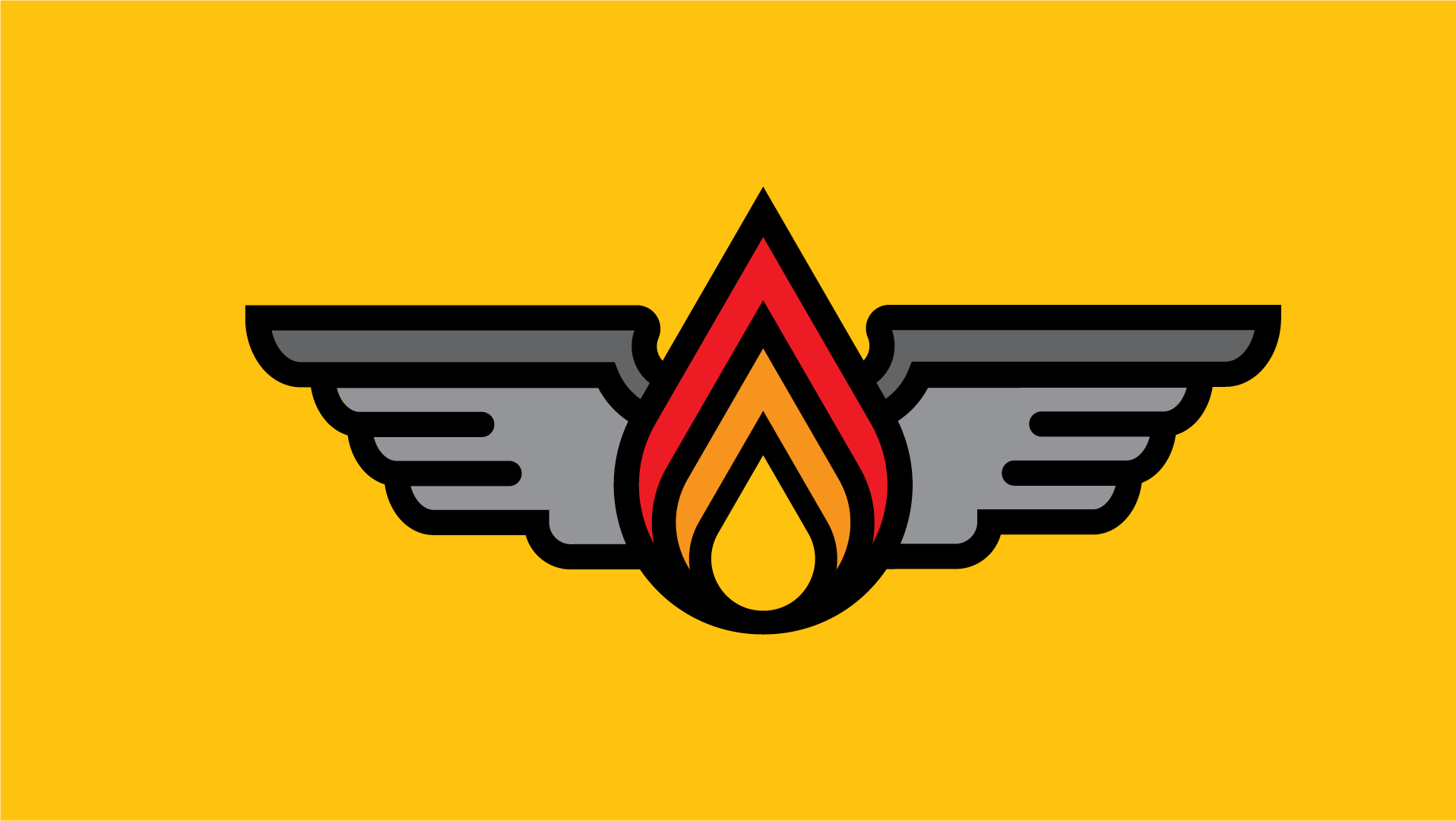
I kicked off my free-lance career with this logo for Asheville Custom Renovations. He reached out to me expressing a need for a logo that would be a step up from the plug and play logo he pulled off of a public domain image site.
Brief:
- simple logo with scalable icon
- strong font and color palette
- applications for stickers, decals, etc
The icon symbolizes an A frame house, which I felt was appropriate for Asheville given the abundance of A-frames in this wooded, camping Mecca of the Appalachian Mountains. An added bonus, the icon is in the shape of an A - for Asheville
The colors and overlapping of colors symbolize the home going from what it was to what it is - the essence of home renovations. I wanted to convey renovation without the obvious "crossing hammers" or something stereotypical.


